
FloraGoGo Mobile App
IDF Project - Created by me with mentor feedback
Background
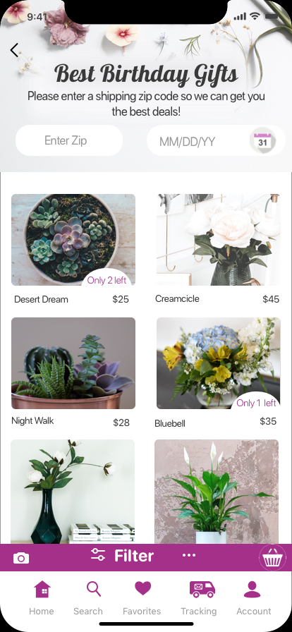
FloraGoGo is an app-based start-up that lets anyone send floral arrangements delivered same-day. They partner with local florists to create speedy deliveries and offer florists a way to increase their market.

Challenge
Users and Florists do not have a fast, modern, intuitive way to get flower arrangements delivered on-demand from their phones. We need to fill the market space for an on-demand app that will be faster to use than the desktop counterparts.
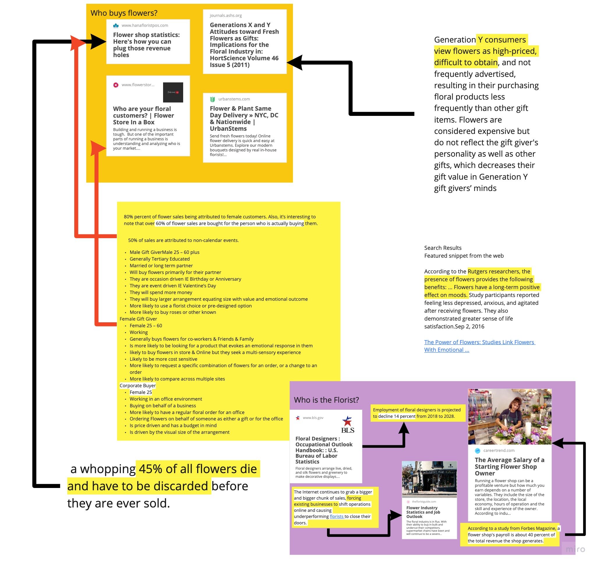
Who buys Flowers?
As someone who hasn’t purchased flowers but loves research, I started digging into studies. My findings were:
Women purchase flowers for themselves, as gifts, and are often the corporate buyer of arrangements.
Men buy flowers as gifts
Generation X spends more on flowers for gifts Generation Y, who is more likely to purchase from an app, has a lower price point for arrangements.
“45% of
Flowers die and have to be discarded before ever being sold”
— https://www.hanafloristpos.com/flower-shop-statistics/
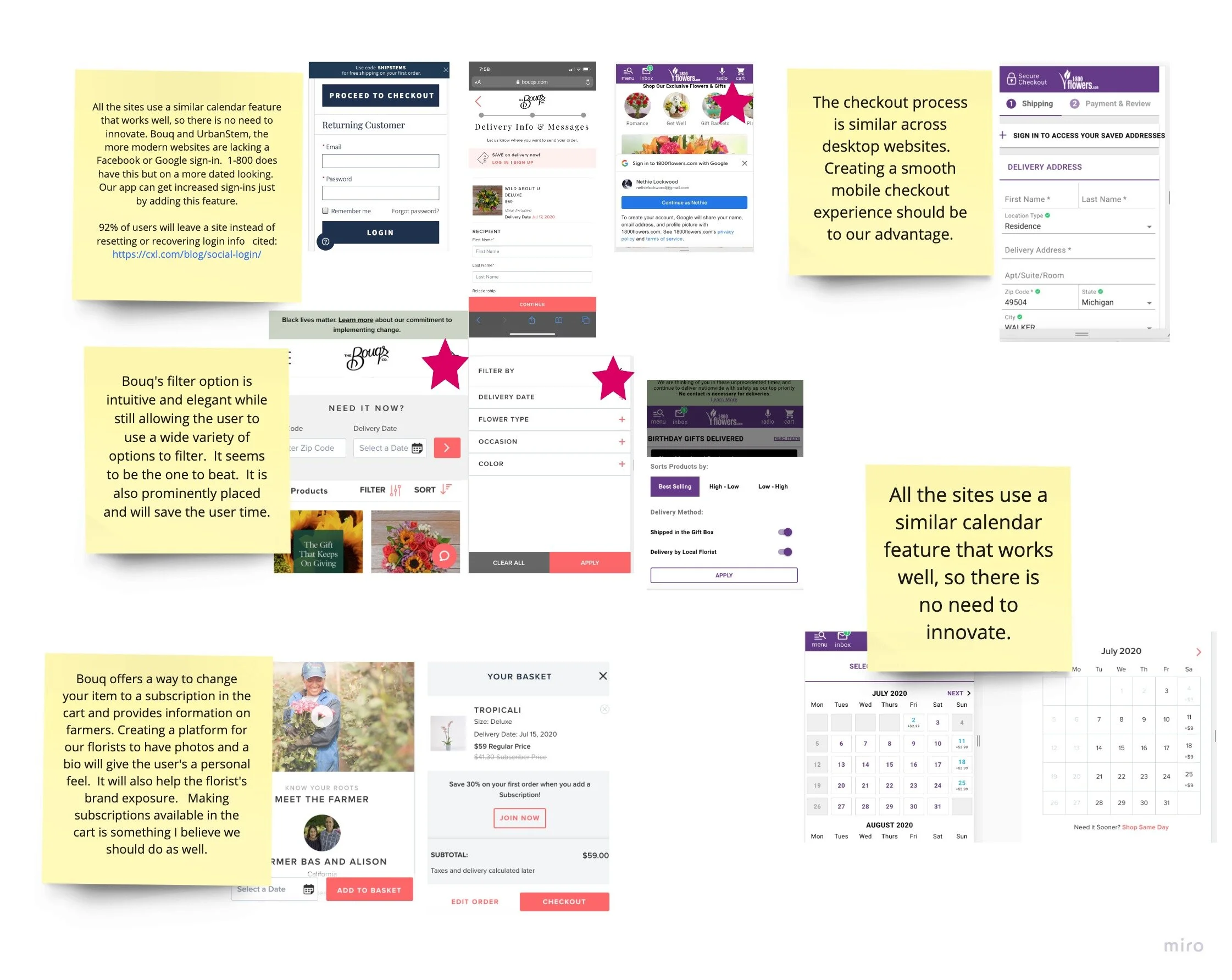
Competitive analysis
Creating a competitive analysis was an eye-opener since one of our competitors has a mobile-friendly website that mimics an app. Main points:
Competing against "clunky desktop" services brought to mind the age of the buyers who spend more.
One competitor has a responsive site that feels like an app
Florists need to sign a restrictive contract with the competition
If FloraGoGo's contract-free partnership provides access to a wide enough audience, florists will prefer us to the competitors. I needed to design something that would be smoother than the most modern site and not create user issues with an older audience.
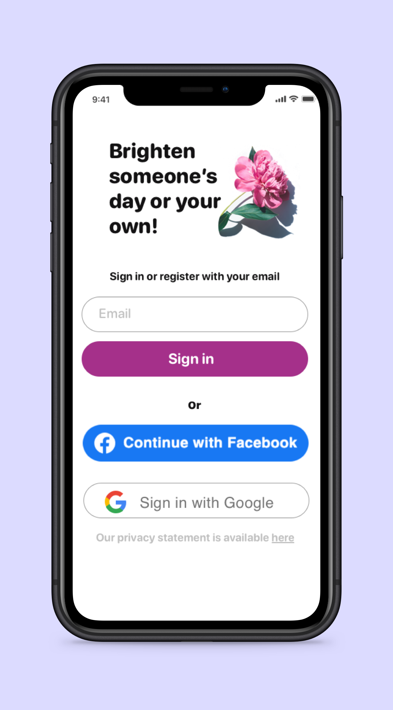
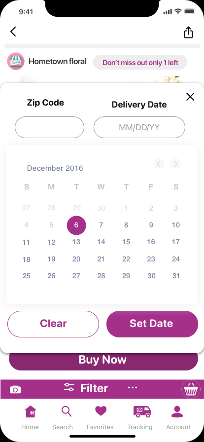
Usability Test with Wireframe
I used card sorting for testing my initial wireframe.
Noteworthy observations:
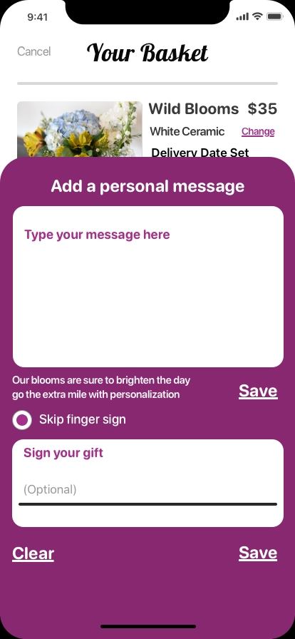
An older participant took an unexpected direction, which caused them to miss the gift settings entirely. I created a redirection.
The notes section had an option that none of the users utilized so it was removed.


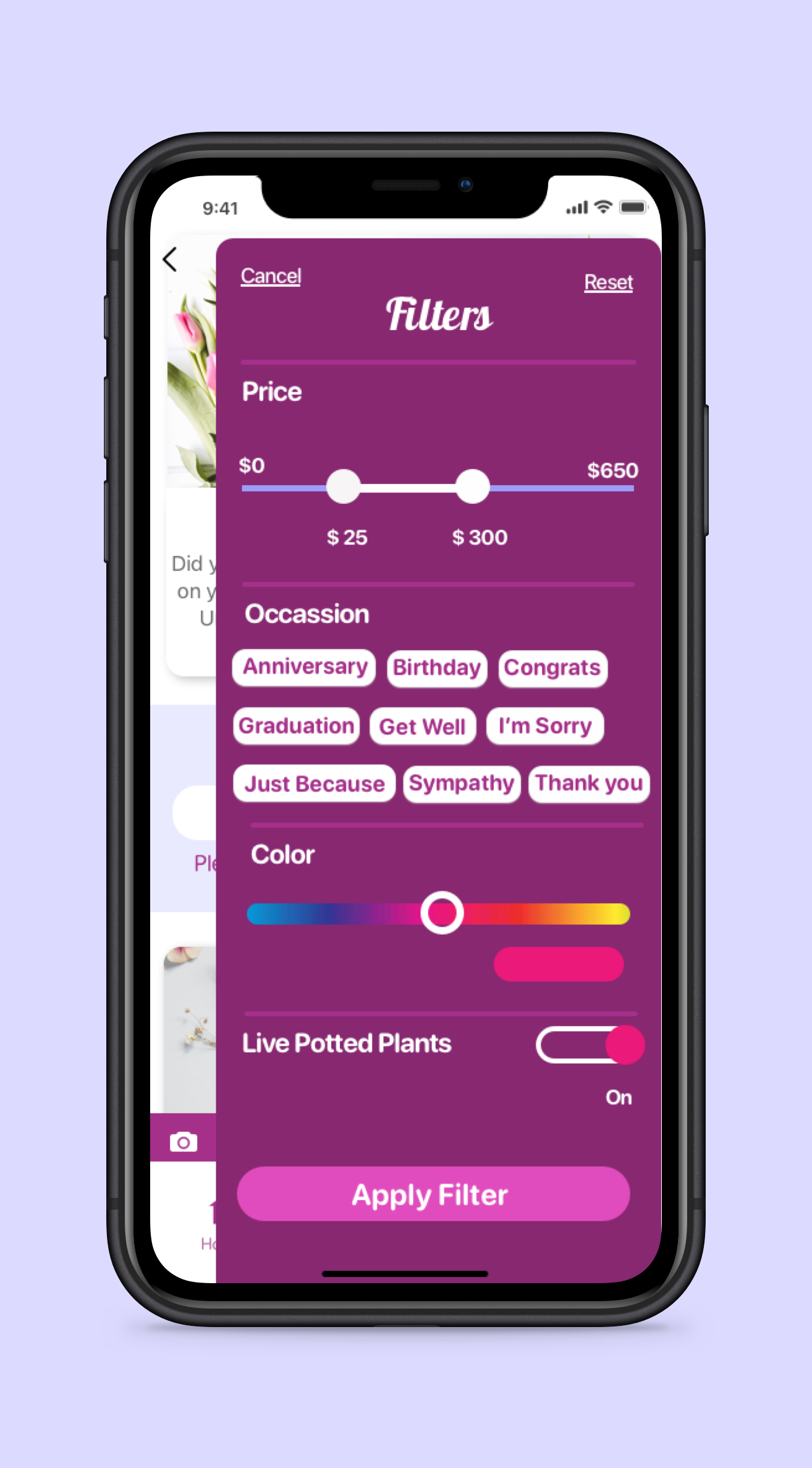
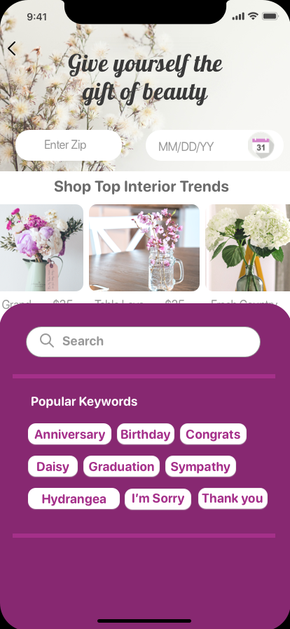
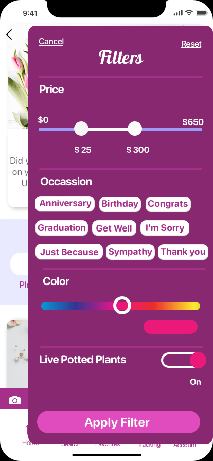
After creating this wireframe, I realized the filter was too similar to a competitor, with minor improvements. I needed to streamline the options to be competitive.
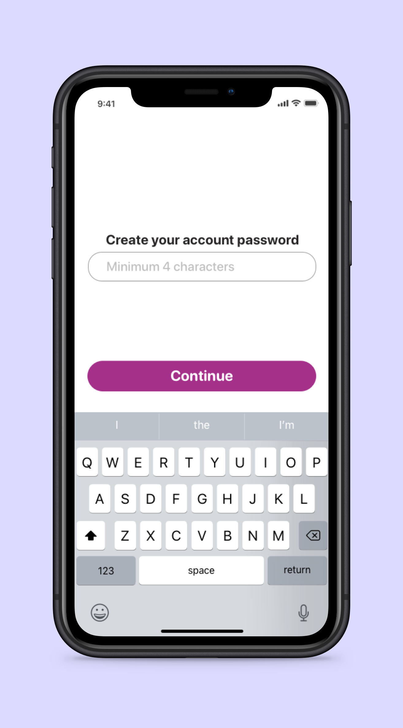
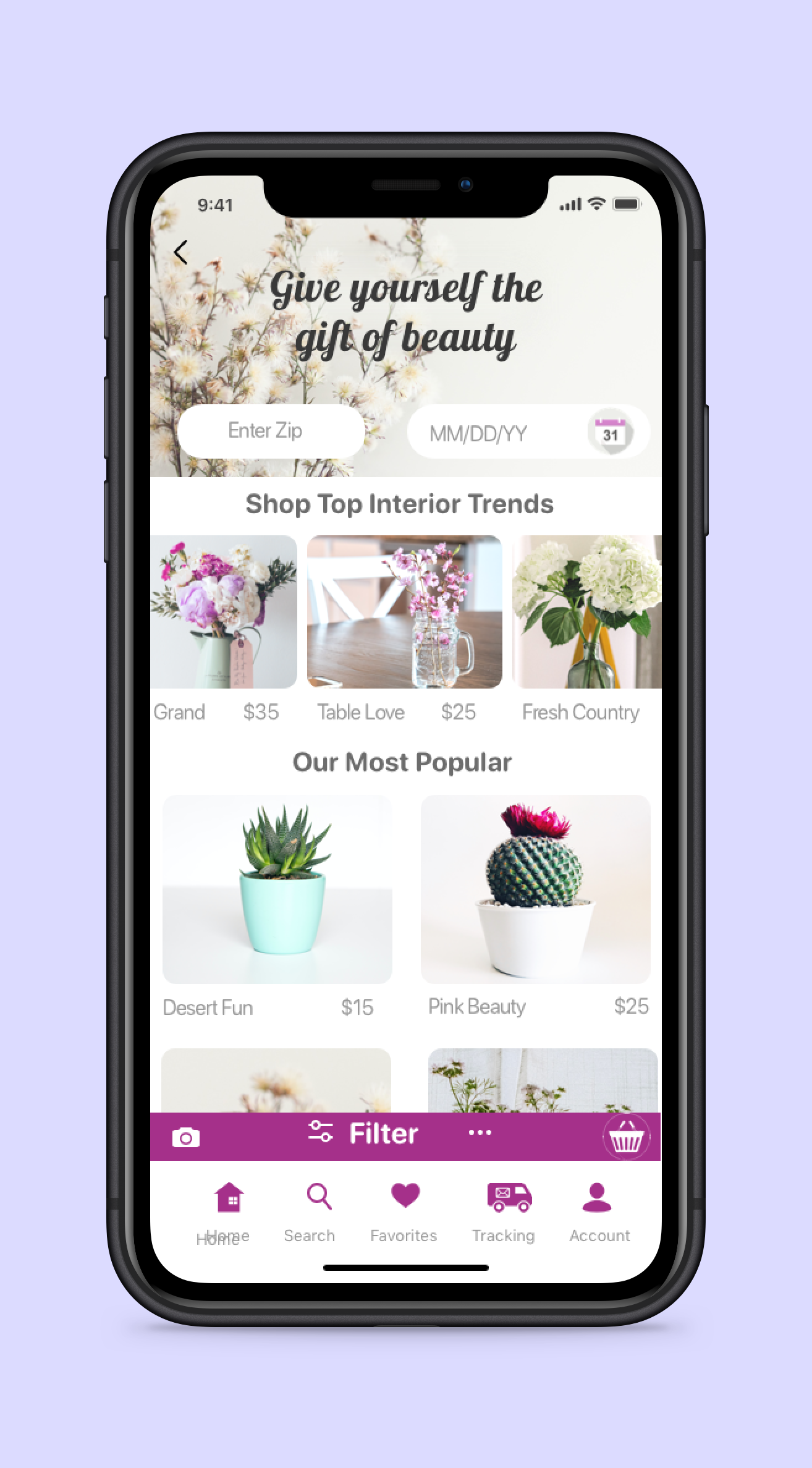
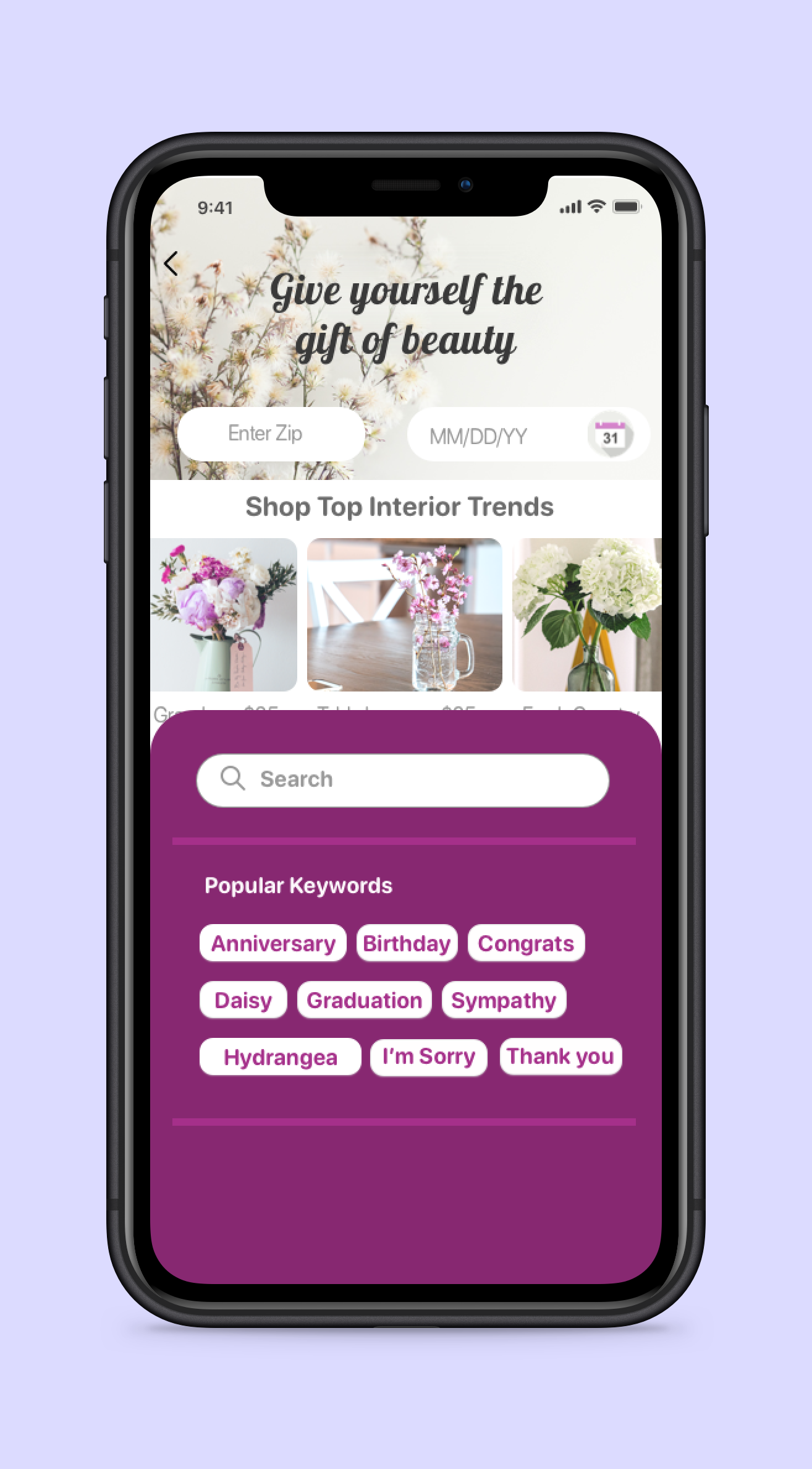
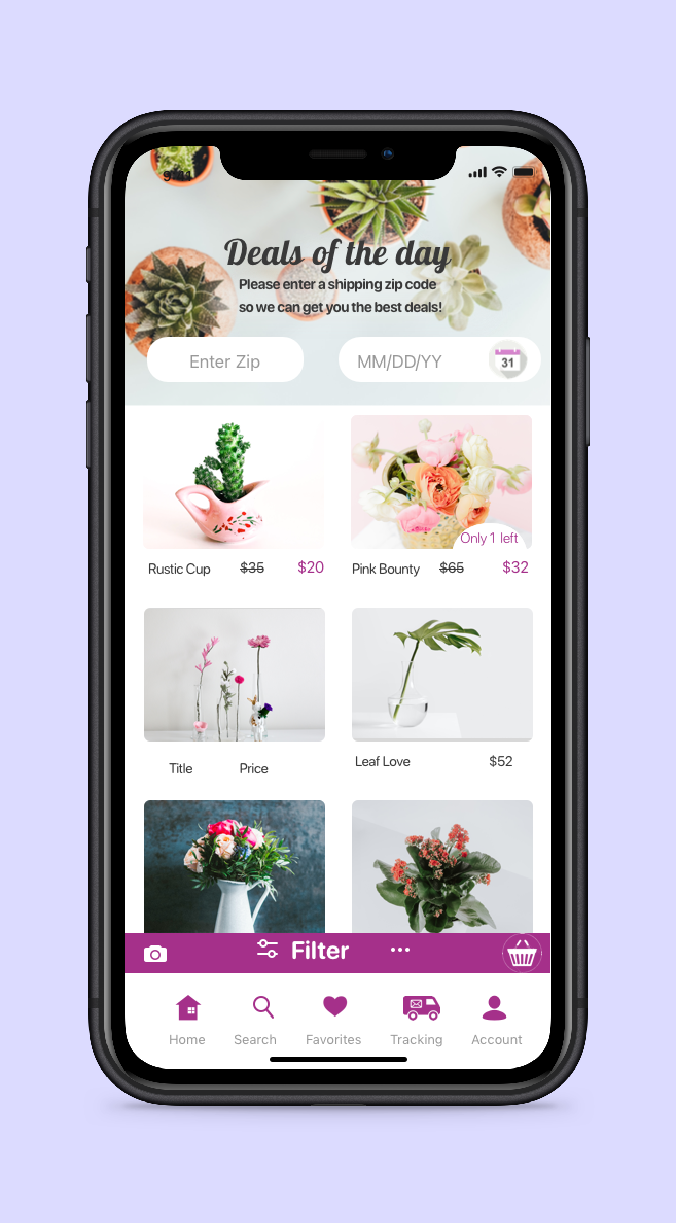
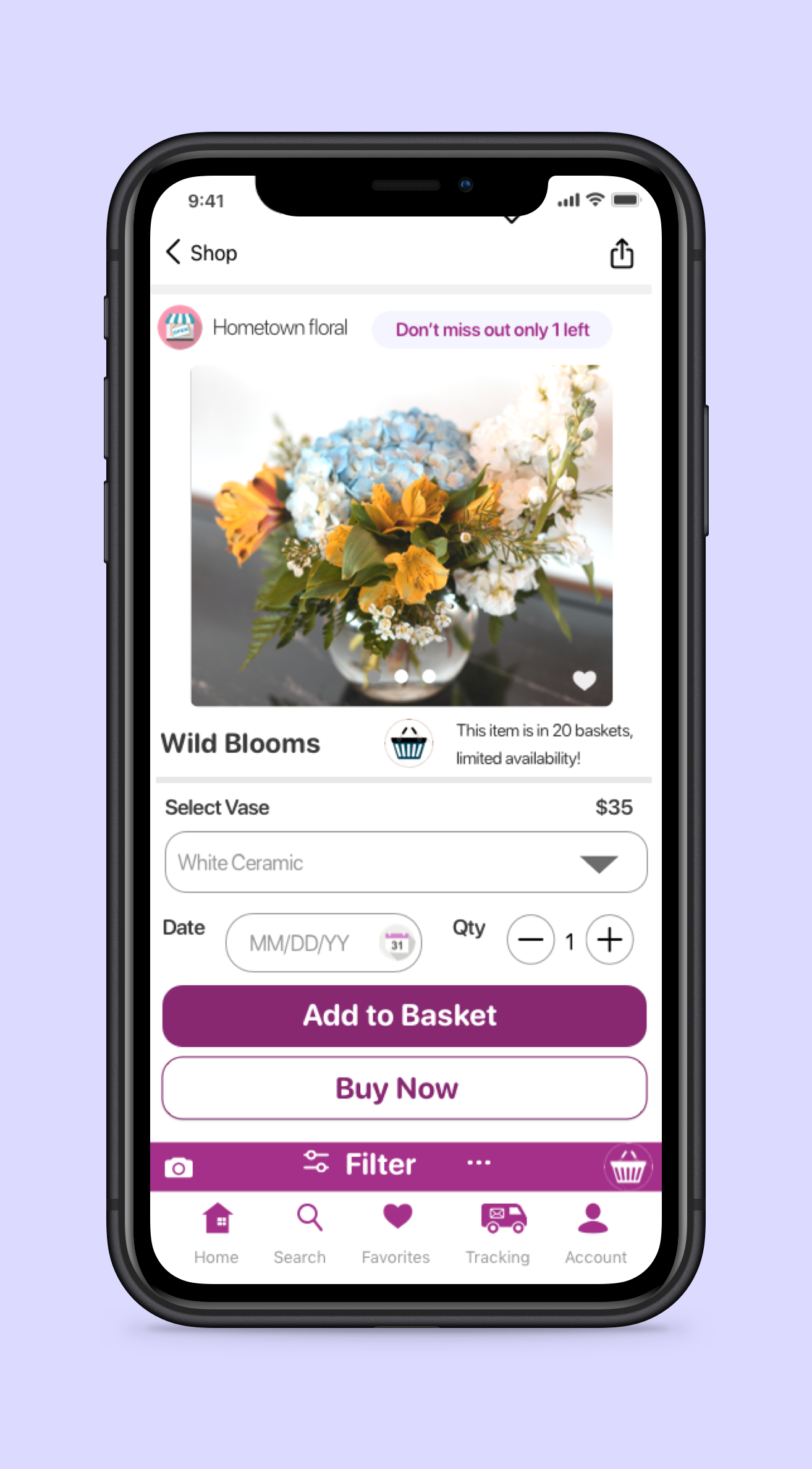
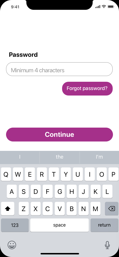
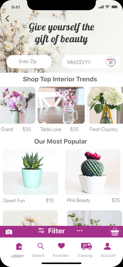
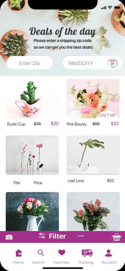
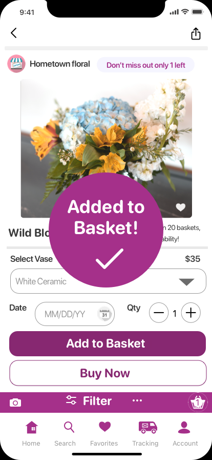
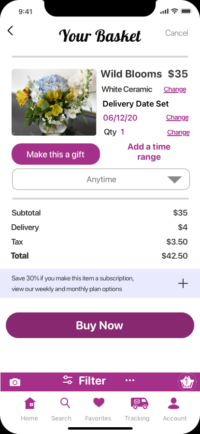
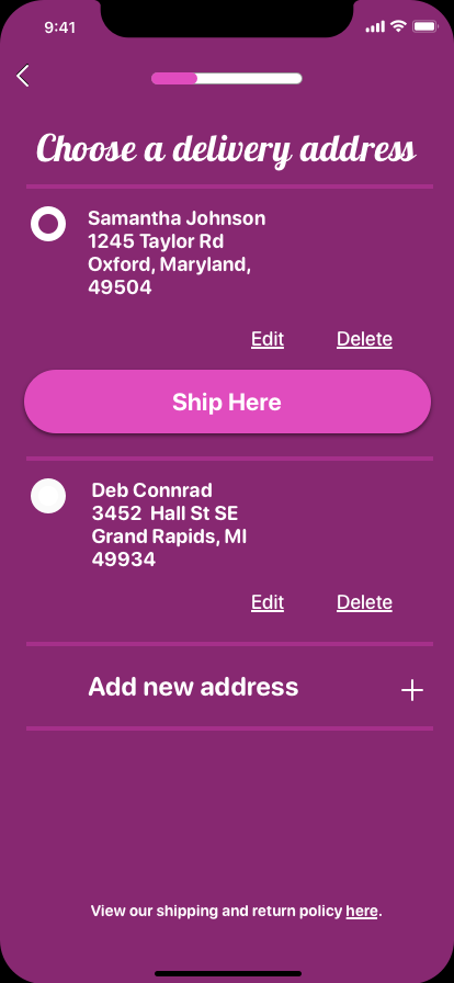
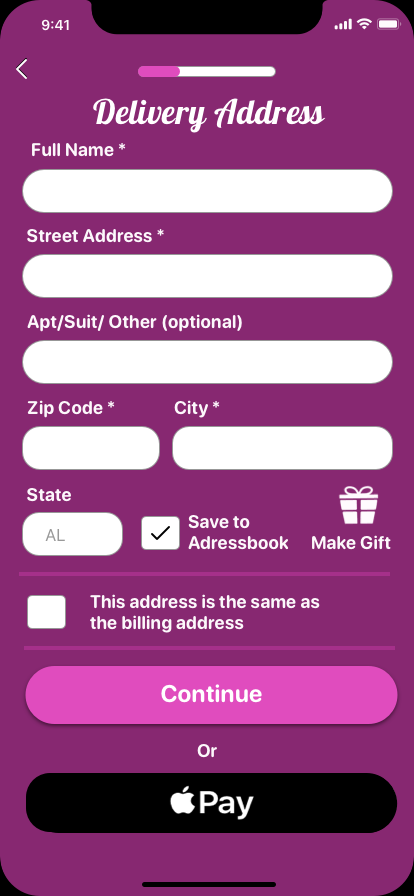
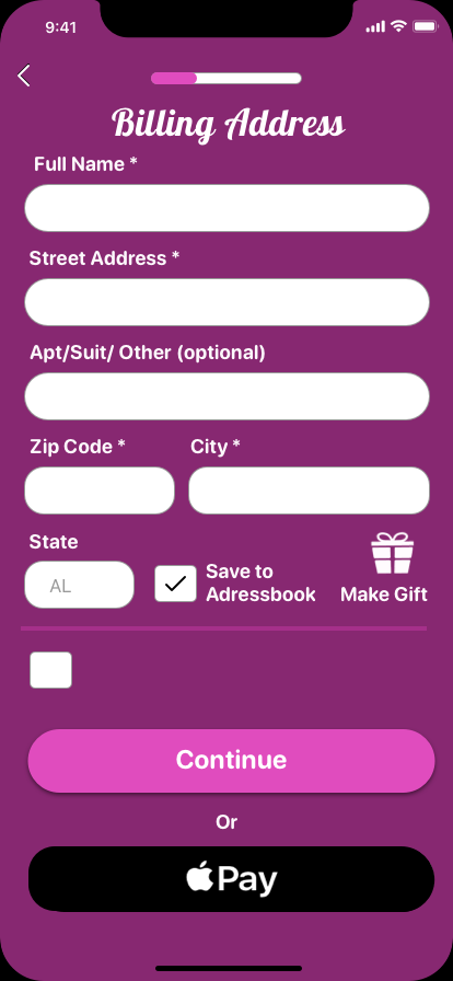
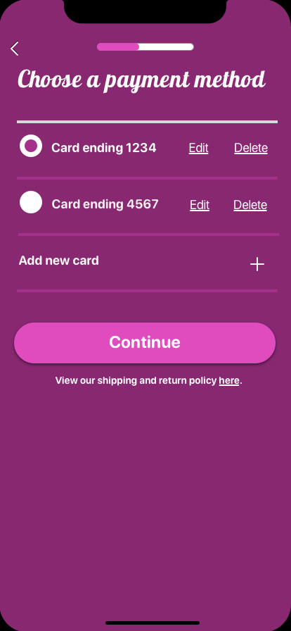
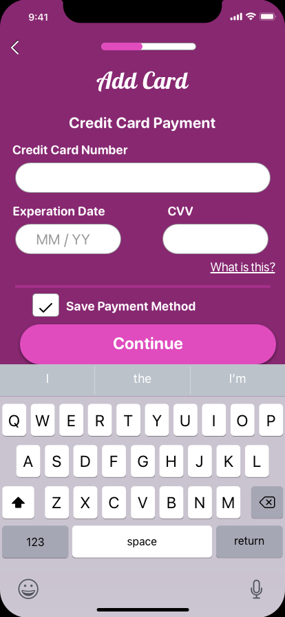
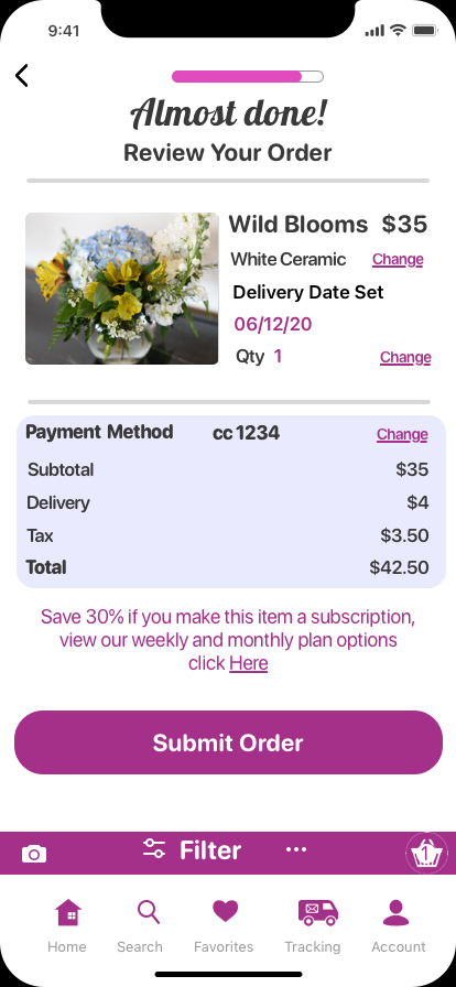
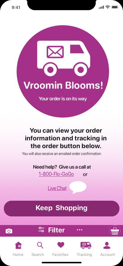
Prototype
I did an A/B test on the color scheme of my checkout pages. I chose brighter colors with higher contrast to appeal to an older audience, who spends more on arrangements. That color scheme was the majority winner!
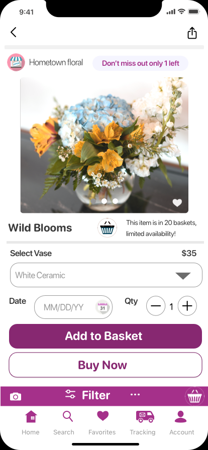
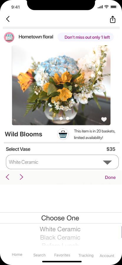
The participants in both the florist application and customer testing could complete their tasks intuitively.

LEARNED
I need to follow my instincts, but of course, not without testing them.
Sometimes it's better to redesign something from scratch if you think it is weak versus tinkering with it.